Split-screen is a smart design pattern that divides one screen into two. You have probably seen split-screen in the film and TV industry many times, but have you noticed the popularity that has gained in web design as well? Many successful companies prefer this approach and there is a good reason for this! If you want to know more about split-screen and how your website can benefit from it – stay with us, and you will find some fresh ideas and techniques below.
Yin & Yang concept
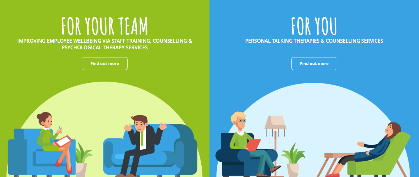
In Chinese philosophy, yin & yang describes how conflicting forces could raise each other as they interrelate to one another. In our case, the split screen is especially valuable when you have two products or promotions on your website. They might be related, however, they target entirely different audiences. Split-screen will enable the users to navigate through your site quickly and select between the two options, without confusing them. Same as in the yin and yang concept, this technique will allow each of the products to differentiate itself and complement each other at the same time. To achieve that result, you need to present both sections with equal size and importance. A great trick is to use vibrant colours and play with the contrasts – this will visually stimulate the users and help them distinguish between the options. Talk Works, a company offering talking therapies and counselling services In Newcastle & Gateshead, has a website that successfully utilises the split screen to direct their visitors to the relevant section while complementing the design with fresh and friendly illustrations.
Split Screen and Call-to-Action Buttons
Call to action buttons are the buttons that guide you to a specific operation and ask you to take any action. Some examples could be ‘add to cart’, ‘sign up,’ ‘call now’ etc.
Call to action buttons are fundamental to the effectiveness of your website and they help you convert your website visitors into subscribers or customers. That’s why it is strongly recommended to feature clear and engaging call to action buttons that will guide the visitors straight to subscribing to your newsletter, registration or whatever your goals are. The split-screen is highly effective, drawing attention to call to action buttons. One way of doing that is creating a flow between the screens by taking some elements and replicating them to the buttons. Also, you can use dramatic typography that goes from one screen to another which is a visually exciting design. Some websites even use one-half of their homepage to display call-to-action buttons, as the other half could represent an image or graphics.
Split-screen it is a visually exciting and functional technique which will allow you to show multiple sections while keeping an excellent visual experience. If you like the idea, but need help, feel free to contact us – we’d be happy to give you some great ideas!