Facebook-owned Instagram has just been given a visual overhaul. The photo-and-video-sharing application introduced a new icon and updated its Android and iOS apps' interface with a black-and-white design.
Instagram held on to its old icon for quite a while, but the company finally decided to change its skeuomorphic style. The new image, which draws inspiration from the previous design, is a flatter, more colorful reflection of the app's growing, 400 million-strong community.
"When Instagram was founded over five years ago, it was a place for you to easily edit and share photos. Over those five years, things have changed," wrote Ian Spalter, Instagram's Head of Design, in a Medium post. "Instagram is now a diverse community of interests where people are sharing more photos and videos than ever before, using new tools like Boomerang and Layout, and connecting in new ways through Explore."
The new icon seems to be polarizing opinion; people either love it or hate it. You can see how the team came up with the design, and some of the other possibilities that were considered, in the video below.
Within the app itself, Instagram has introduced a much simpler look that removes the colors previously found in the user interface. Now, the UI consists of mostly white and gray, with text appearing in black. The company says it wants the only color to come from the content users upload.
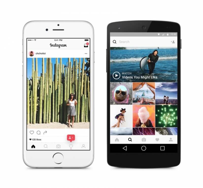
"The simpler design puts more focus on your photos and videos without changing how you navigate the app," Instagram said in a blog post.
Other than the visual overhaul, Instagram remains the same. The company has also updated the icons for its Layout, Boomerang, and Hyperlapse apps.