On the face of it, punctuation is not the most electrifying of subjects. A comma is a comma, a period is a period, and a semicolon is an argument waiting to happen. Look past squabbles over grammar, however, and punctuation's staid veneer peels back to reveal a seething, Darwinian struggle that has played out over two millennia of the written word.
Though the period can claim an unbroken lineage stretching back to ancient Greece, and the quotation mark may boast of its roots in the early days of printing, for every venerable survivor there are countless other symbols that did not make the grade. The road from the scrolls of the library of Alexandria to today's books, blog entries, and tweets is littered with the corpses of fallen marks of punctuation. Here are just a few of them:
Pilcrow
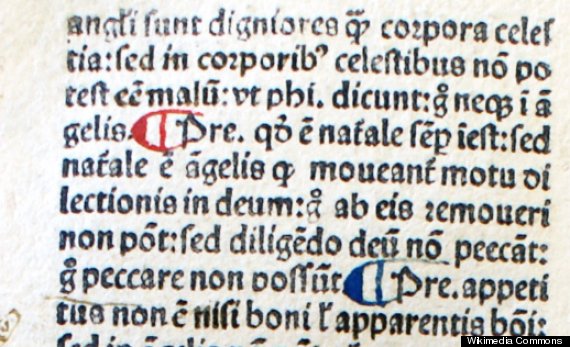
The pilcrow (¶) is the poster child of abandoned punctuation marks. With roots in ancient Greece, the pilcrow started life during the fourth century BC as the paragraphos, a horizontal line drawn in the margin of many a papyrus scroll to indicate that something of interest lay in the corresponding line. The reader was left to determine precisely what that something was.
Evolving over the centuries into its modern reverse-P shape, the paragraphos came to be used to break texts into meaningful chunks such as paragraphs and sentences. With this duty came the trappings of its elevated role, and pilcrows were often separately inked in eye-catching colored ink. When the printing press arrived and the volume of new books skyrocketed, the spaces left for the pilcrow often went unfilled, and from the pilcrow's ashes arose the indented paragraph.
Though it still lurks in word processor menus and printers' type cases, the pilcrow of today is a typographic curio--a reminder of more extravagant times past.
Tironian et
A modern writer seeking to abbreviate the word "and" will doubtless reach for the ampersand (&). Things were not always thus, however, and for much of its two-thousand-year existence the ampersand was up against a rival mark boasting a conspicuously elevated pedigree. The 7-shaped "Tironian et" was the brainchild of Tiro, secretary to the famed first century BC orator Marcus Tullius Cicero.
Part of a system of Latin shorthand created at Cicero's behest, Tiro's mark survived well into the middle ages as an abbreviation for the word et, or "and." Ultimately, though, for superstitious medieval writers the cryptic symbols of Tiro's system were uncomfortably reminiscent of distrusted pagan runes, and Tiro's system was pushed into disuse. Though it survives in Irish Gaelic, everywhere else the Tironian et has conceded to the ampersand.
Virgule
Before printing imposed a degree of order on written language, the conventions of punctuation were very much up for grabs. Buoncompagno da Signa, a twelfth century man of letters, took a stab at creating a system of punctuation comprising only two marks: a slash (/) for short pauses and a horizontal line (-) for longer pauses. Da Signa called his marks virgulae, from the Latin virga, meaning "rod," "staff," or even "penis."
The fortunes of the two marks were very different. By the fifteenth century the slash was in widespread use as a marker for any pause within a sentence, while its dash-like sibling had long since fallen into obscurity. The slash has been so successful, in fact, that it exists even today: though you might be hard pushed to recognize it, the mark the French still call la virgule has since retreated to the base of the line of text. We call it the comma.
Manicule
For centuries after its invention, punctuation was the province of the reader, not the writer. The average ancient Greek or Roman struggled through texts devoid of commas, periods, and even word spaces, punctuating as they went to help pick apart the words and their meaning. Well into the medieval ages, even after punctuation had been established as the writer's responsibility, readers continued to annotate their books with symbols to help index and recall the information therein. The manicule (☞)--or, if you prefer, the hand, hand director, pointing hand, pointing finger, pointer, digit, index, or indicator--was a favorite of Renaissance scholars, inked into the margin as a bookmark or aide-mémoire. Gradually, though, the manicule was appropriated by authors and advertisers, and today its pointing finger is more likely to be seen on A-boards than in book margins.
Percontation Mark
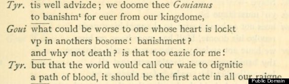
When punctuation was first invented by Aristophanes, librarian at Alexandria in the 4th century BC, he suggested that readers could use middle (·), low (.), and high points (˙) to punctuate writing according to the rules of rhetoric. Despite this, it took another two millennia before the eponymous rhetorical question got its own mark of punctuation. Worried that his readers would not catch such a subtle figure of speech, in the late sixteenth century the English printer Henry Denham created the percontation mark--a reversed question mark--to address the problem.
The only problem with Denham's plan was that typefaces did not generally include reversed question marks. Though his own books boasted custom-made percontation marks, other printers resorted to blackletter or italic question marks instead. (Some modern reprints have used semicolons, rotated through 180 degrees, while others employ regular question marks.) Faced with a wave of apathy, use of the percontation mark had petered out within fifty years of its birth.
Interrobang
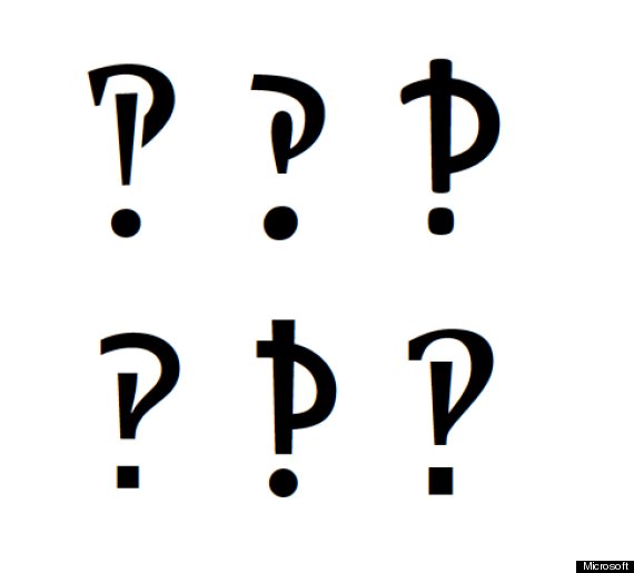
Don Draper has nothing on Martin K. Speckter. The head of his own advertising agency, and with the Wall Street Journal on the books, in 1962 Speckter tried to sell the world a new mark of punctuation. Writing in "Type Talks," Madison Avenue's journal of typography, Speckter described the "interrobang" (‽) as a combination of a question mark and an exclamation point (or "bang," as printers called it) and said that it should be used to punctuate an excited or rhetorical question. Other ad men suggested the names "emphaquest," "rhet," and "consternation mark" but Speckter's own term stuck.
By 1967 the interrobang had found its way into a new font called Americana, and a year later it made its debut on the typewriter keyboard, but its success was short lived. Though Speckter's mark never quite broke into the mainstream, with the appropriate digital gymnastics you can still conjure one up from your computer keyboard.
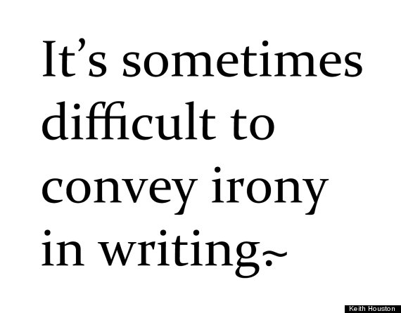
Snark
The need to punctuate irony--whether a rhetorical question that is not a question at all, or a common-or-garden sarcastic quip--runs deep in the veins of writers and typophiles. Henry Denham tried it in the sixteenth century, and Martin K. Speckter in the twentieth; the twenty-first century, however, is the most ironic yet. The Internet has produced a steady stream of new irony and sarcasm marks, though the "snark" stands out for the thoroughness of its promotion. Building on earlier efforts to rebrand the tilde (~) as a sarcasm mark, an American typographer named Choz Cunningham added a period to the mix (.~) and created a website dedicated to his new mark. That TheSnark.org now points to a generic placeholder page bears witness to the fortunes of the ill-fated snark.
Ironieteken
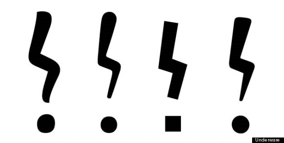
Perhaps the most convincing modern irony mark is a European invention. Commissioned in 2007 for the Dutch national book festival, the ironieteken was created by Bas Jacobs at the type foundry Underware. His graceful zig-zag exclamation mark was designed to blend in with existing marks of punctuation and to be easily written by hand. What Jacobs did not bargain for was that two ironieteken placed next to each other (to punctuate an especially sarcastic exclamation, perhaps) bore not a little resemblance to the insignia of the infamous Nazi SS. Like the percontation mark, the interrobang, and the snark before it, the ironieteken never quite achieved critical mass, and it remains sadly absent from our palette of everyday punctuation.
Keith Houston is the author of the new book Shady Characters: The Secret Life of Punctuation, Symbols, and Other Typographical Marks.