

(The original article was published in 2013 and new recommendations and references were added in 2017.)
The HealthCare.gov team has suffered what most web professionals fear most: launching a broken web application. This is particularly harrowing given the visibility of the website in question. The serious technical and data issues have been covered extensively in the media, so we won’t rehash those. Instead, in this article we focus on how to improve the account setup process. This is a user experience issue, but fixing it will also alleviate the site's capacity problems.
- Account Setup Usability Is Mission Critical
- Account Setup Usability Guidelines
- 3. Prepare users.
- 4. Number the steps.
- 5. Use email address as username when possible.
- 6. Simplify password requirements.
- 7. Provide specific and actionable error messages.
- 8. Allow users to display passwords.
- 9. Remove unnecessary steps.
- 10. Simplify instructions and content for low-literacy readers.
- Conclusion
- References
Account Setup Usability Is Mission Critical
Account setup is users’ first taste of a service. A suboptimal account setup can spawn 3 problems:
- Increased service cost: When people can’t self-service online and you have no competitors, they call you. Call-center interaction is more expensive than web self-service. In 2008, Forrester estimated call-center calls to cost $5.50 per call versus 10 cents for a user who self-services online.
- Increased cognitive strain: The instructions for creating usernames and password in this flow (which we address further along in this article) require a great deal of concentration, and if users don’t understand the instructions, they will need to keep creating usernames and passwords until they are accepted.
- Halo effect: Account setup is the first in a series of web-based interactions that users will need to conduct on HealthCare.gov. A poor experience with this first step will impact how people feel not only about subsequent interactions with the site, but how they feel about the service in general and the Affordable Care Act as a whole.
Account Setup Usability Guidelines
NN/g has developed thousands of usability guidelines for creating useful and usable interfaces. The following are just 10 of those guidelines as they pertain to account setup.
1. Allow users to see the products or information before registering.
According to an article on Reuters.com (“U.S. contractors shift blame for HealthCare.gov problem”), when HealthCare.gov launched, prospective enrollees had to register before they could view the plans. This problem has been somewhat addressed later by adding a See Plans Now button on the homepage, an article about viewing health plans, and an externally hosted calculator. Through years of usability testing, we have observed that forcing users to register before seeing their options is never a good experience. When information is not provided upfront, users tend to move into a defensive mode. They don’t know what to expect and whether what awaits them after registering is worth the effort of creating an account. This issue is an example of a login wall and is similar to requiring prospects to register before they can check out on ecommerce sites. It goes against the law of reciprocity. (The law of reciprocity says that people are more likely to respond positively to a request such as filling in a form if they are given something — for instance, information — in advance.)
Also, this lack of information and required registration could have contributed significantly to system failures, because account setup requires more processing power (that is, server or database calls) than simple browsing of the site to gather information. Forcing people to create an account before being able to view options generates a tremendous one-time burden on your system.
2. Keep calls to action (CTAs) and other pertinent information above the fold.
There are certainly examples of sites that have drastically improved conversion rates when they moved CTAs below the fold — and preceded the CTAs with persuasive, meaningful content and useful features. However, at HealthCare.gov, people who come to this site want insurance — they don’t need to be sold on it. What is pushing the CTAs down the page is a big hero image that does not contain useful information.
Worse, depending on users screen size, window size, and resolution, it may not be clear that there is any content below the virtual page fold, so they may not scroll. People do scroll, but only if it’s obvious that there is more content to be had.

Above, we have illustrated where the virtual fold occurs at a resolution of 1366x768. As you can see, it is not obvious that there is content below the fold. Instead, users may believe that their only choices are the two buttons overlaying the image (Individuals & Families, Small Business Owners) and the 4 global navigation choices (Learn, Get Insurance, Log In, Español, and Help). Many sites do attempt to funnel users into subsites targeted to individual market segments, so users could quite reasonably assume that this site takes a similar approach. The key rule governing the web user experience is that users spend most of their time on other sites and thus have formed their expectations for your site based on their cumulative learning from common design patterns on those other sites.
When users simultaneously encounter an illusion of completeness and a seemingly sensible set of options above the fold, they can be excused for not looking below the fold. On the other hand, the designers cannot be forgiven for having created this illusion of completeness, since this is one of the most well-documented problems in web usability.
Recommendations
Place the Choose Your State and Apply buttons up much higher on the page. To make space for them, either replace the hero image or position the buttons alongside the image (below marketing content or replacing it).
3. Prepare users.
A process-like, iconic graphic appears after the user has selected a U.S. state and clicked the Apply Now button. Unfortunately, it doesn’t explain the account setup process at all.

Note that the previous page in the process, Get Insurance, contains a high-level overview of the entire process from account setup to enrollment. Unfortunately, most people won’t see it because it is placed below the call-to-action buttons.
Recommendations
Replace the graphic with the information that answers the following questions:
- How much time will this take?
- Do I need any special information ready before I start?
- Is this part of a larger process? The Marketplace application is mentioned — where does that fit into the big picture?
4. Number the steps.
On the next screen, most users will not recognize the 3 dots as a progress meter because:
- They are located in the lower-left corner (progress meters are typically across the top).
- They are unfamiliar to many people who don’t use Apple products.

Recommendations
- Replace the dots with numbered steps or a percentage-complete progress bar.
- Locate the progress meter at the top of the forms.
5. Use email address as username when possible.
The username creation criteria are incredibly confusing:
- Must be 6–74 characters
- Must contain a lowercase OR capital letter (What does "lowercase" mean?)
- Must contain a number OR an acceptable symbol: _ . @ / -)
- Or, does it actually mean lowercase OR number OR symbol? Can it have more than one?

We assumed that an email address would meet the criteria, but it caused an error (see recommendation 7 for why that occurred).

The error message also does not indicate what is wrong with the username; which of the criteria does it not fulfill?
There are 6 benefits to using email address for username:
- Email addresses are easier for users to remember.
- The email address is a unique identifier.
- It’s standard practice on millions of other websites.
- It reduces error rates because people don’t have to parse the overly complicated criteria.
- It simplifies the process by eliminating the creation of a unique username.
- It could reduce steps in this account-setup process by combining the email address step with the username and password step.
Email addresses as usernames pose some difficulties too:
- Email addresses can change when users change jobs or internet providers.
- People lose access to their email accounts accidentally by forgetting their passwords or having their accounts hacked.
- Email addresses are often public or guessable.
In some applications, people need a username to display, and sometimes that must be different than their real names. The username might also need to be more stable over time than their email address. So think through these issues when deciding what to use for the login.
Recommendation
Work with your security experts to determine whether email addresses can serve as usernames.
6. Simplify password requirements.
As with the username, password criteria are incredibly confusing:
- Must be 8–20 characters
- Must contain a lower case letter, an upper case letter AND 1 number
- Must be different than your past 6 passwords (What? Where? In all the web?)
- Cannot contain your username
- Cannot contain these symbols: = ? < > ( )’ " / \ &
(Note that the slash character is allowed in usernames but prohibited in passwords. While this is a smaller problem, it adds to the confusion. Better to either avoid listing these cryptic characters or have the same list for both pieces of user input.)

Complex password schemes often create a flurry of errors and, worse, high abandonment rates.
What exactly is the reason for each of these requirements? For example, “It must be different than your past 6 passwords”: Is this instruction necessary here, when users are first creating a password? We typically only see this in Intranet password-change instructions. And what about the specific disallowed symbols: Is there something about them that will conflict with backend code? Why don’t we see these restrictions on other websites?
Recommendations
- Work with your security experts to determine what drives each of these requirements and then determine if these are reasonable. It’s important to be persistent to get to the bottom of this complexity in order to figure out how to eliminate it.
- Follow the latest NIST guidelines for passwords.
- Encourage people to make note of their passwords, to write them down or put them in a password manager. Janrain research in 2012 found that 90% of people admit they have left a website if they forgot their password or login information instead of going through the password recovery process. (Janrain mentions using login providers as an alternative, but people don't always want to associate their accounts with Google or social media websites that provide identity and login services, and users may have trouble remembering later which provider they used.)
7. Provide specific and actionable error messages.
Errors are a fact of web-life. Designers and developers are working tirelessly to prevent them, but when they can’t, the next best thing is an easy recovery. But it’s difficult to recover from an error when the cause of the error is not identified.
For example, we had cut and pasted an email address into the email field and received a “This is not a valid Email address” error.

Was this email invalid because it had the term “testignore” in it? No, it turns out that we had accidentally added an empty space at the end of the address when cutting and pasting it. (Something that's invisible and thus won't be caught by most users.) Once the space was deleted, the email address was approved.
Recommendations
- For email and password errors, most users won’t or can’t troubleshoot. Make error messages specific, or, at least, include a list of potential causes so that users can attempt to identify the issue.
- Remove leading and trailing spaces programmatically and don't bother the user about them.
- When email addresses are allowed as usernames, suggest that possibility.
8. Allow users to display passwords.
As users type their new password into the 2 fields (Password and Confirm Password fields), the letters do not appear (not even for a split second, as with some applications). Instead, they just see dots, which can cause some usability issues, particularly on mobile devices, where typing is more difficult.

Masking passwords actually lowers security. Users make more errors or use overly simple passwords to reduce the chance of making an error when they cannot see the text that they input.
Recommendations
- Allow users to display passwords on password-creation forms so they can correct mistakes, copy their new password, or write it down.
- Offer an accessible method to mask and unmask the password, such as a checkbox or labeled link.
- Provide this show / hide method on login dialogs too.
- Allow copy / paste and drag-and-drop interaction for login and password-creation forms.

After Healthcare.gov was rescued, the United States Digital Service (USDS), 18F, and Code for America formed to address US government digital transformation and usable services, following in the footsteps of the U.K. government Digital Service. The 18F sign-in form pattern (shown above) demonstrates the new, more-usable standard, which complies with their accessibility guidelines for forms.

Along with the Show password toggle link, on touchscreen login forms, an eye glyph is becoming a common way to show / hide passwords. Usually this is a simple drawing of an open eye with a diagonal line drawn through it for the "hide" state. Like the link method, the eye glyph toggles between the two states when touched. Whichever indicator you choose, make sure it's accessible and that your users understand it.
9. Remove unnecessary steps.
Every step in a process is one more chance for a user to drop out of the online application and pick up the phone. On many sites, users don’t have to set security questions on initial signup; instead, they do it when they first log in. If the site relies on security questions for username and/or password recovery, it may need to include this step at signup. We could not determine if that was the case for HealthCare.gov, because password and username recovery were not working. In 2017, however, security questions are part of their account setup and the whole process has been consolidated into a one-page step.
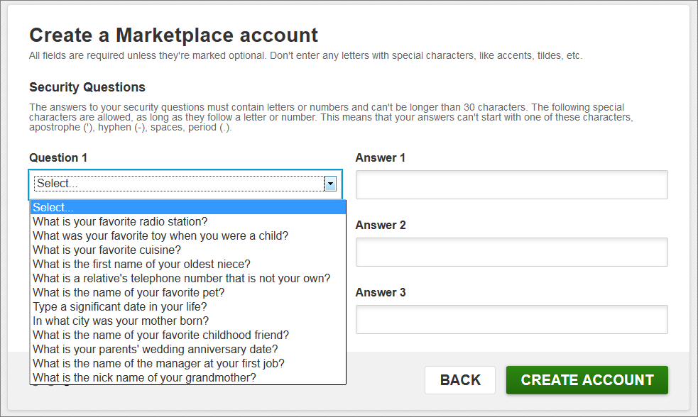
Recommendations
- Avoid security questions, because they can actually detract from security. Answers such as your mother's maiden name, pet name, where you were married, or your first car model may be matters of public record, are often stolen in data breaches, can be known to close associates, and may be harvestable from social media. People have difficulty remembering the answers to unusual questions. Password reminders are also a terrible idea, because people tend to put their passwords in them or some very obvious hint, making it easy for attackers to capture or guess the password.
- Use 2-factor authentication. For accounts that don't need high security, sending SMS codes or voice codes to the user's phone is better than nothing, but NIST recommends this method be phased out. For better safety, security professionals recommend using apps like Google Authenticator, Microsoft Authenticator, a Yubikey, or an enterprise hardware token or smartcard. What's best for your website depends on your particular security requirements and concerns, which are a constantly changing situation as attacks and defenses become more sophisticated over time.
10. Simplify instructions and content for low-literacy readers.
The HealthCare.gov site adheres to the Federal Plain Language Guidelines as indicated by a link in the footer of the site. We measured the grade level of instructions and articles on the site (using the Flesch-Kincaid Readability Test), and found that it is generally written at a 9th-grade reading level. Still, the audience for this service is extremely broad and is likely to contain a higher proportion of low-literacy readers. Our research indicates that in order to reach people with particularly low literacy levels, it’s better to write 6th-grade copy.
The more confident users feel about having understood the instructions and the concepts behind the site, the more they will persevere through slight difficulties with the interaction. Conversely, if users are confused to begin with, they'll get even more confused if the site doesn't work like they expect. A growing feeling of defeat will make people abandon the site.
Recommendation
While the very best would be to simplify the underlying concepts, as a shorter-term fix, write even simpler instructions and explanations.
Conclusion
Tweaking to meet these usability guidelines is low-hanging fruit that can have a significant impact on costs. Such usability fixes lighten the load on the backend, because a better UX can prevent users from attempting the same actions over and over again. When people cannot sign up online, they call, causing enrollment costs to increase exponentially. If users get confused with something as simple as online signup, they’ll be wary of every other online interaction that the organization offers.
Because of the heroic efforts of the developers and designers who stepped in to fix Healthcare.gov, the website is in much better shape in 2017 (although not all of our guidelines have been followed and some new problems have been introduced). Kudos to the "rebel alliance" of digital-government teams worldwide, who help governments move services online and into the 21st century. Thank you for helping better serve billions of people by providing access to usable government services.
References
NIST (National Institute of Standards and Technology) Digital Identity Guidelines
National Cyber Security Centre (GCHQ UK) Password Guidance: Simplifying Your Approach
Design: Passwords – GOV.UK Service Manual
18F Accessibility Guide – Forms
Login.gov – Single-signon for US digital government services

