
Uber, the wildly successful taxi-service app that garners both good and virulently hateful feeling, just released maps of how its services are used in the 100 cities in which it now operates.
Releasing beautiful maps is a well-worn strategy for tech companies to get a little bit of free press. Foursquare, the location check-in app, released a bunch of maps last year, Facebook did the same, and Instagram regularly releases lists of the most photographed places in the world. (Considering Quartz covered all of these, the free press strategy is self-evidently working.)
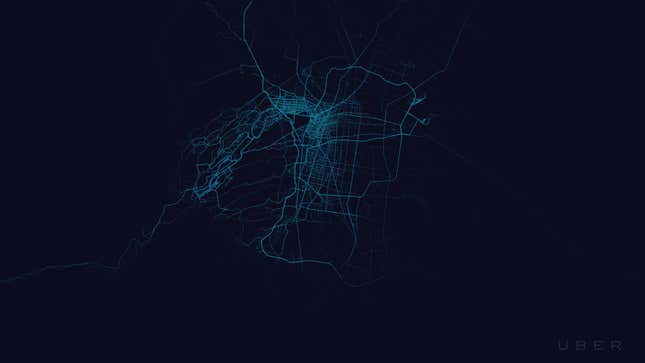
But what makes Uber’s maps different is that they go beyond telling you about how the service is used—Foursquare’s maps, for instance, look like little more than night-time shots of cities from the sky—to reveal the demographic contours of cities. Take the image above, of New York. Uber is clearly popular on the island of Manhattan, and gets decent traffic out to Brooklyn. But few residents of Queens, which is poorer and skews older (pdf), seem to use the service. The Bronx is invisible.
What the world’s cities would look like without poor or old people
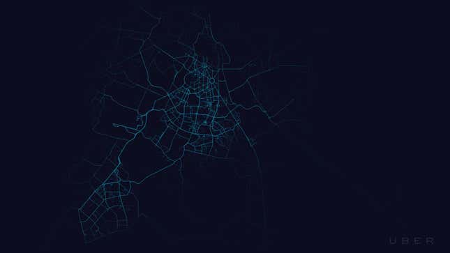
Here’s Mexico City. The gridded areas where Uber services seem most concentrated are neighborhoods like Polanco (high-end shopping), Condesa (trendy restaurants and galleries), and the Zona Rosa (nightlife), where the young and well-heeled hang out. There’s also a high concentration on the main avenues of Lomas de Chapultepec, one of the wealthiest areas of town—the higgledy-piggledy bit to the west—but less so on the residential streets, suggesting a lot of Uber users pass through but the people who live there, who tend to have have their own cars and even drivers, don’t use it so much. But large swathes of this enormous city are dark.
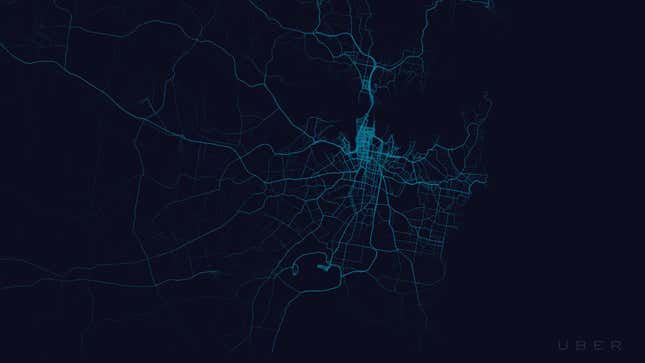
This is Sydney, where the vast majority of rides are in the central business district (centre) and the inner, more desirable suburbs, such as Surry Hills.
One of the starkest examples is New Delhi, where the north, west and east of the city get virtually no Uber cars driving through. The city center (the octagonal shapes) and the south, home to wealthy, young Delhi-ites and plenty of bars and restaurants, is bright blue.
It’s the same story in Mumbai, with only the south and west of the city showing any inclination towards Uber.
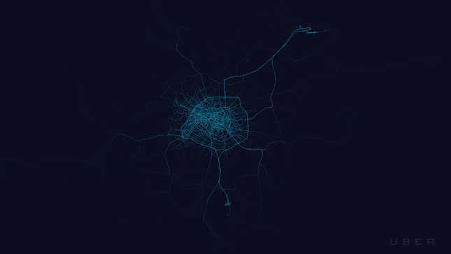
Paris is one large playground for the rich anyway, but note the areas outside the Périphérique, or ring road. While the desirable western suburbs feature on the map, the banlieues are, unsurprisingly, pretty bare.
It should, of course, come as no surprise that Uber users tend to be younger and richer. For one thing, they need a smartphone to access the service. Moreover, Uber remains a particularly American obsession. Those who use it in Europe, where public transport and decent cabs are plentiful, or in other countries, where car service is expensive, are likelier to be younger and more connected to American trends.
Nor is this is the first time smartphones and their apps have been used to identify where the world’s rich live. A lovely set of maps that showed smartphone use by platform also showed the divide between iPhone users and Android users in the world’s cities.